A financial adviser website should do more than look professional. It should help the right prospective clients understand the firm, trust what they find and feel comfortable taking the next step.
That sounds straightforward, but many advice websites still behave more like digital brochures than working marketing assets. They list the services, introduce the team and provide a contact page, while leaving visitors to work out why the firm is relevant to them and what makes it different.
A stronger website connects positioning, branding, content, adviser expertise and conversion into one clear experience. It does not simply tell people what the firm does. It helps them decide whether they want to know more.
Your website should make the value of your firm easier to understand before an adviser ever speaks to the prospective client.
In this article
- Give the website a commercial role
- Start with the clients you want
- Clarify the proposition before the layout
- Build a homepage with clear priorities
- Create journeys around client needs
- Make adviser profiles work harder
- Build content and search into the site
- Use proof to build confidence
- Make the next step easy
- Design for clarity and real use
- Connect the website to the wider business
- Know when the site needs attention
- Measure what happens after launch
Give the website a commercial role
It is easy to treat a website redesign as a creative project. The colours need refreshing, the imagery feels dated and the existing pages could be made to look more modern.
Those observations may be valid, but they do not yet explain what the website needs to achieve. A useful project begins with the commercial role of the site and the people it needs to support.
Does the firm need to attract more of a particular type of client? Strengthen referral-led growth? Give individual advisers a more credible presence? Improve organic visibility? Make the enquiry journey clearer? These questions provide a much stronger basis for design decisions than visual preference alone.
A better-looking website is useful. A website that helps the business grow in the right direction is far more valuable.
Reach the right audience
Give search, social media, referrals and campaigns a credible destination designed around the clients the firm wants.
Make the firm easier to understand
Communicate who the business helps, where its expertise sits and why its approach may be particularly relevant.
Support the next decision
Help visitors continue their research and make contact when they have enough confidence to begin a conversation.
The website should sit inside the wider digital marketing strategy rather than operate as a separate design project. It provides the central environment where somebody can bring together the impressions created by articles, advisers, search results, recommendations and external coverage.
When that role is clear, the project becomes easier to judge. The question is no longer whether everybody likes the homepage. It is whether the website helps the intended audience move towards a better understanding of the firm.
Define the objective
Design decisions need a commercial reason
Start with what the business needs the website to improve, then decide how structure, copy and design should support that outcome.

Start with the clients you want
Before planning the pages, it helps to understand why somebody is likely to arrive. One visitor may have received a recommendation from an existing client. Another might have discovered an adviser on LinkedIn, while someone else may be searching for an answer to a particular retirement or investment question.
These visitors begin with different levels of awareness and trust, but they are all trying to orientate themselves. They need to know whether the firm understands people like them, whether its expertise is relevant and whether the experience feels credible enough to continue.
A clearer target market gives the website a defined audience to prioritise. The firm may retain a broad service, but the most important messages and journeys can be shaped around the people it genuinely wants to attract.
A website becomes easier to structure when you know whose questions it needs to answer first.
Think in situations as well as services
Clients do not always arrive knowing which financial service they need. A business owner may be thinking about what a future company sale means for their personal life. A couple approaching retirement may simply want to know whether they can afford to stop working.
These situations provide much stronger starting points than asking the visitor to choose immediately between investment management, pension advice and cashflow planning. The website can begin with the decision the person recognises, then show how different areas of advice may help.
Who are they?
Understand the clients, financial circumstances and relationships the business is particularly well placed to support.
Why are they looking now?
Identify the life, business or financial event that has made advice feel more relevant or urgent.
What do they need to understand?
Build pages around the uncertainty and decisions the person is trying to resolve before they know the service terminology.
Recognise different entry points
A referred prospect may begin with confidence in the person who introduced them but still need to validate the firm. A search visitor may know nothing about the business and require more education before they consider an adviser. Someone coming from social media may already recognise an individual adviser but know very little about the organisation behind them.
The site should make sense whichever route brought the visitor there. Important pages need enough context to work as entry points in their own right rather than assuming everybody starts on the homepage.
Design around real behaviour
Not every visitor enters through the front door
Articles, adviser profiles, location pages and campaign pages should still help somebody understand where they are and what they can do next.
Do not organise everything around the business
Internal structures do not always make intuitive website structures. The business may think in departments, service lines and office locations, while the visitor thinks in questions, needs and decisions.
A useful client journey starts from the prospective client’s position and then guides them into the expertise behind it. This may still involve conventional service pages, but those pages should be connected to the situations that make the service meaningful.
Use the client’s perspective
Your organisational chart is not your website navigation
Build the structure around what visitors need to understand rather than expecting them to learn how the business is arranged internally.
Clarify the proposition before the layout
A designer can make almost any message look attractive. They cannot make an unclear proposition meaningful through layout alone.
Before the visual design begins, the firm needs to be clear about who it is for, what clients value and why its approach deserves consideration. Without those decisions, homepage discussions can quickly become dominated by vague requests to feel more modern, premium or personal.
A strong value proposition gives the website a central idea. It connects the intended audience with the firm’s expertise and explains what the client gains from choosing this particular business.
Positioning gives the design something meaningful to communicate.
A service list is not positioning
Pensions, investments, retirement planning, protection and estate planning may all be important parts of the firm’s work. Many competing advice businesses can offer something similar.
The website needs to explain more. Who commonly needs this advice? What situations bring them to the firm? What does the business understand especially well? How does the experience differ from another suitable adviser?
The answers may not be revolutionary, but they need to be specific enough to make the firm easier to understand.
Define the audience
Decide which clients and financial situations the most important website journeys should be designed around.
Clarify the value
Identify what the firm’s expertise, experience and service model allow those clients to understand or manage more easily.
Find the evidence
Use advisers, content, client feedback and real examples to support the position rather than relying on marketing claims alone.
Shape the journey
Organise pages and calls to action around what the visitor needs to understand at each stage.
Turn strategy into clear language
The proposition still needs to sound natural once it reaches the page. Internal phrases about holistic solutions, bespoke planning and client-centric service may be accurate, but they give prospective clients very little to picture.
Strong financial services copywriting translates the strategic position into language people can follow. It connects the firm’s expertise to real decisions without removing the nuance that makes the advice valuable.
The website should not ask visitors to translate professional terminology into a reason to care.
Make the brand part of the strategy
The visual identity should reinforce the same position. A business presenting itself as modern, accessible and straightforward will struggle if the website feels formal, dated or difficult to navigate.
Strong financial services branding connects the visual identity, language and wider experience. The website becomes the most substantial expression of that system, not simply somewhere the logo and colours have been applied.
Join the thinking up
Strategy, copy and design should tell the same story
The firm becomes easier to trust when its positioning, language and visual presentation reinforce one another rather than pulling in different directions.

Build a homepage with clear priorities
Many financial advice homepages try to say everything immediately. The opening screen contains a long introduction, several services, accreditations, adviser details, news, reviews and more than one call to action.
The page may contain plenty of useful information while giving the visitor very little guidance about what matters first. A stronger homepage creates a clear hierarchy and gives each section a distinct job.
The homepage test
Can a new visitor understand the firm quickly?
They should be able to recognise who the business helps, why its approach may be valuable and where they can go next without decoding the page.
Lead with relevance
The first section should orientate the right visitor rather than attempting to communicate every detail. A clear headline and supporting introduction can establish the audience, the central value and the broad next step.
This does not mean reducing the firm to a vague slogan. It means choosing the most important message and allowing the rest of the page to develop it in a sensible order.
Establish relevance
Help the intended visitor recognise that the firm understands people in their circumstances.
Explain the difference
Show how the firm’s expertise, experience or approach creates value beyond a standard list of services.
Create useful routes
Guide different visitors towards relevant audiences, services, advisers, content and evidence.
Use the homepage as a guide
The homepage does not need to contain the complete explanation of every service. Its role is to introduce the firm and help visitors choose the most relevant route deeper into the site.
A business owner may need an audience page built around company and personal wealth. A referred prospect might want to meet the advisers, while an early-stage search visitor may benefit from a useful guide before considering the service itself.
The homepage should create direction, not attempt to replace the rest of the website.
Control the number of competing messages
When every section is given the same visual weight, the page begins to feel busy. Awards, services, reviews, tools, team members and articles all compete to become the main reason somebody should keep reading.
Good hierarchy makes choices. It gives the most commercially important messages greater prominence while allowing supporting detail to remain accessible without demanding equal attention.
A homepage becomes clearer when the business decides what visitors do not need to see immediately.
Create journeys around client needs
Once the homepage has created direction, deeper pages need to continue the conversation. The visitor should move naturally from a recognisable situation into the relevant expertise, evidence and next step.
This requires more than adding links between pages. Each page needs a clear role within the journey and should answer a different set of questions.
A good website journey gives the visitor the next useful answer before asking for the next commitment.
Build service pages around outcomes and decisions
A service page should explain more than what is included. It needs to connect the service to the circumstances that make it valuable.
A retirement-planning page might explore the uncertainty around timing, income and drawing on accumulated wealth. A business-owner page may need to connect company decisions with personal financial planning. The technical service remains important, but it is presented through the client need.
Why might I need this?
Describe the events, questions or financial complexity that commonly bring somebody towards the service.
How could advice help?
Explain what professional planning can make clearer, better organised or easier to decide.
What would happen next?
Give the visitor a realistic understanding of how the firm approaches the work and how a conversation begins.
Use audience pages where they add value
Some firms serve recognisable groups whose needs extend across several services. Business owners, senior professionals and families managing intergenerational wealth may all benefit from dedicated audience journeys.
These pages should not become generic service pages with a different audience added to the heading. They need to reflect the decisions, language and areas of complexity that make the audience genuinely distinct.
Show real understanding
Naming the audience does not prove you understand it
Use specific questions, examples and expertise to demonstrate why the firm is relevant to that group.
Give every page a distinct purpose
Websites often grow by adding new pages whenever another search phrase, audience or campaign appears. Over time, several pages begin competing around almost the same subject while none provides a complete answer.
A clear content architecture should define what each page is for, which question it answers and how it relates to nearby pages. This improves the reader journey and makes internal linking more useful because every link leads somewhere meaningfully different.
Avoid content overlap
More pages do not automatically create a better website
Build a smaller number of useful, clearly differentiated pages before multiplying near-identical versions of the same subject.
Match calls to action to readiness
A visitor reading an introductory article may not be ready to arrange a meeting. Another person reviewing an adviser profile after a recommendation may be much closer to making contact.
The next step should reflect that difference. Early-stage visitors can be guided towards related information, while higher-intent pages can explain the consultation process and offer a more direct route to the firm.
Make adviser profiles work harder
Financial advice is a relationship-led service, which makes individual adviser pages some of the most important content on the website. Despite that, they are often reduced to a photograph, job title and brief career history.
A stronger profile helps prospective clients understand who they could actually be working with. It should connect the adviser’s experience to the people and decisions they support, while giving enough personality for the individual to feel approachable.
Prospective clients may trust the firm and still need to feel comfortable with the individual adviser.
Who do they commonly help?
Describe the client groups, financial circumstances and stages of life the adviser regularly supports.
What do they understand?
Connect qualifications and experience to the actual financial decisions where that knowledge becomes useful.
What may the relationship feel like?
Give prospective clients a sense of how the adviser communicates and works with people over time.
Connect advisers to their visible expertise
An adviser profile becomes considerably stronger when it links to useful articles, research, media commentary and client situations connected to that individual. The prospective client can see what the adviser knows rather than relying entirely on the biography’s claims.
This also supports adviser thought leadership. The website gives individual expertise a permanent home, while other channels introduce people to it.
A biography describes the adviser. Their published thinking helps demonstrate the adviser.
Keep website and LinkedIn profiles consistent
Someone introduced to an adviser may research them on both the website and LinkedIn. Differences in job title, specialist areas, photographs or company descriptions can create unnecessary uncertainty.
The two profiles should not contain identical copy, but they should clearly represent the same person and professional position. A coordinated LinkedIn presence helps individual and company visibility reinforce one another.
Connect the individual and firm
Adviser visibility should strengthen the company brand
Give people enough room to sound human while maintaining a consistent level of quality, positioning and presentation around them.
Plan for advisers joining and leaving
Team pages need to evolve as the firm grows. New advisers should have a clear onboarding process covering photography, biography, areas of expertise and links to relevant content.
The website structure should also avoid making important client journeys dependent entirely on one individual page. Where appropriate, services and expertise should remain connected to the wider firm so relationships can continue smoothly as teams change.

Build content and search into the site
A website is not finished when the homepage and service pages are launched. Prospective clients have questions that extend far beyond the core proposition, and those questions create opportunities for the site to become more useful over time.
A connected content programme can answer those questions, demonstrate expertise and give advisers material to share. It also creates additional entry points for people who may discover the firm through a subject before they search directly for an adviser.
Build a living website
The site should become more useful after launch
Articles, guides, research and adviser insight can gradually turn a static brochure into a deeper marketing asset.
Plan content around clear themes
Publishing unrelated articles every few weeks can increase the size of the website without building a clear body of expertise. A stronger content strategy organises the library around the audiences, questions and subjects the firm wants to become known for.
Related articles can then support one another. A broad guide introduces the subject, more specific pages answer individual questions and relevant service or adviser pages connect the information to the firm’s expertise.
Introduce the wider subject
Create substantial cornerstone content around the decisions and audiences most important to the firm.
Answer specific questions
Develop supporting articles around individual concerns, misconceptions and stages of the decision.
Lead towards the expertise
Use natural internal links to help readers move into suitable advisers, services, evidence and related information.
Let SEO influence the architecture
Website design and SEO should not happen as completely separate projects. Search research can reveal the questions people ask, the terminology they use and where the current website has gaps.
That information is particularly useful before a redesign because it can influence page roles, navigation and the relationship between services and supporting content. It is much easier to build a sensible structure at the beginning than force new search pages into an unsuitable architecture later.
Search research should help organise useful information, not turn the website into a collection of keyword pages.
Use local pages only where they are genuine
Regional firms may also need dedicated office or location pages. These should explain a real local presence, including the advisers based there, the surrounding areas served and how client meetings work.
Strong local SEO is built around genuine relevance rather than dozens of near-identical town pages. One useful regional page will normally provide a stronger client experience than a large collection created only by changing the place name.
Build genuine search value
Create pages people would still find useful without the keyword
Search optimisation works best when it makes relevant expertise easier to discover rather than creating content solely for rankings.
Build internal links for people first
Internal links should help readers continue a line of thought. Someone learning about retirement may be guided towards a more specific article, a relevant adviser or an explanation of the advice process.
Natural anchor text makes that journey feel part of the article rather than an interruption. The aim is to help the visitor find the next useful page, not insert the same full keyphrase wherever a link is required.
A well-connected website feels like a useful resource rather than a collection of pages stored in the same place.
Use proof to build confidence
Financial advice is difficult to assess before somebody experiences it. Prospective clients therefore look for evidence that the firm’s claims are credible and that other people have trusted it with important decisions.
That proof can take several forms. Adviser expertise, genuine reviews, client stories, recognised qualifications, regulatory information and relevant professional credentials may all help, provided they are presented clearly and in context.
Trust becomes stronger when the website demonstrates credibility rather than repeatedly claiming to be trustworthy.
Use reviews to explain the experience
Genuine client reviews can communicate aspects of the relationship the firm cannot say as convincingly about itself. Clients may describe advisers as responsive, clear, reassuring or particularly good at making complex information easier to understand.
The language matters as much as the rating. It gives prospective clients an impression of what working with the firm may actually feel like.
Show the experience
Use genuine feedback to demonstrate how clients feel about the communication, service and relationship.
Show the work in context
Explain the client’s situation, the adviser’s approach and what changed without relying on unsupported outcome claims.
Show the people behind it
Connect specialist claims to relevant advisers, experience and useful published insight.
Use case studies to make expertise tangible
Well-developed case studies can help prospective clients recognise situations similar to their own. They show how the firm thinks and what the advice process can involve without turning the page into a list of services.
Client stories should retain enough detail to feel meaningful while respecting confidentiality, permissions and the firm’s relevant approval procedures. Removing every specific detail protects privacy but may also remove the reason the story was useful.
Put evidence where it helps
Place proof close to the claim it supports
A relevant review or client story is more useful beside the corresponding service, audience or adviser than hidden in a separate archive.
Use credentials with context
Awards, qualifications and accreditations can strengthen confidence, but a wall of unexplained logos may mean little to someone outside the profession. A concise explanation of why the recognition matters can make it far more useful.
Regulatory information and necessary disclosures should also be integrated into the structure appropriately. They need to remain visible and accurate without being treated as content that can only be added after the design is complete.
Design trust into the page
Proof should feel useful, not decorative
Give each trust signal a clear purpose and enough context for the prospective client to understand why it matters.
Make the next step easy
A website needs to encourage action, but adding a large “book a consultation” button after every section is not necessarily the answer. Different visitors will be at different stages of the decision.
The goal is to make the appropriate next step easy to find and easy to understand. That may involve continuing to another article, meeting an adviser, learning about the process or contacting the firm directly.
Keep exploring
Guide readers towards relevant articles and explanations while they are still researching the subject.
Understand the firm
Connect visitors to adviser profiles, client evidence and a clear explanation of how the advice process works.
Make contact simple
Provide one obvious route towards a conversation without unnecessary choices, fields or friction.
Explain what happens after contact
“Contact us” tells somebody what action to take, but not what happens afterwards. A prospective client may wonder who will respond, what the initial conversation involves and whether making an enquiry commits them to a larger process.
A short explanation can reduce that uncertainty. People are more likely to take a next step when they understand it.
A good call to action does not only ask for action. It helps the visitor feel comfortable taking it.
Keep forms proportionate
The firm needs enough information to respond intelligently, but an initial contact form should not feel like a financial fact-find. Every additional field creates another decision and another reason to stop.
Ask for what is genuinely useful at that stage. Further information can be gathered once a person has received a response and understands the process.
A prospective client who has decided to contact the firm should not need to work hard to say they are interested.
Respond as carefully as the website converts
The form submission is not the end of the journey. From the visitor’s perspective, the acknowledgement email and first response are simply the next parts of the same experience.
A polished website followed by several days of silence can weaken confidence quickly. The firm should define who owns new enquiries, how quickly they are acknowledged and what context reaches the adviser.
Thoughtful automation can confirm that the enquiry has arrived and support consistent internal follow-up, but it should not delay the personal response somebody has requested.
Protect the handover
The promised experience begins after the click
Make sure the first human interaction reinforces the quality, clarity and responsiveness presented on the website.
Follow enquiries through to client quality
A page may generate many enquiries while attracting few clients the firm is well placed to help. That does not make the conversion rate meaningless, but it does make it incomplete.
The website should support the broader client acquisition strategy by setting clear expectations and attracting conversations aligned with the firm’s audience, expertise and service model.
Design for clarity and real use
Financial services websites often need to communicate complex information. Good design makes that information easier to navigate rather than adding another layer of complexity.
Hierarchy, typography, spacing, components and imagery all influence whether a page feels understandable. The design should help the reader recognise the main point, scan the supporting detail and find where to go next.
Design for understanding
Clarity is part of the brand experience
A firm that explains difficult decisions clearly should provide a website that makes its own information equally easy to follow.
Make pages scannable
Use descriptive headings that help visitors understand the page even when they do not read every paragraph.
Organise useful detail
Cards, steps, summaries and visual panels can make complex information easier to absorb when used selectively.
Give the content room
Sensible line lengths and spacing improve readability without requiring the firm to remove important substance.
Use design to support the content
Copy and design should influence one another. If every paragraph has to fit into a box chosen before the content existed, the designer may end up shrinking the text or compressing the spacing until the page becomes uncomfortable to read.
Strong financial services design allows the message to shape the layout. The writer identifies what genuinely needs saying, while the designer creates a hierarchy that makes those ideas easier to understand.
Readable content is partly written and partly designed.
Design for mobile from the beginning
A desktop page cannot simply be compressed until it fits on a smaller screen. Mobile design requires its own decisions around hierarchy, navigation, spacing, buttons, tables and content components.
The main purpose of the page should remain clear on every device. Important messages should not disappear beneath several screens of supporting detail, and contact routes should remain comfortable to use without accidental clicks or excessive scrolling.
Responsive design should preserve the purpose and hierarchy of the page, not simply make every element smaller.
Make accessibility part of good design
Financial information needs to be usable by a wide range of people. Readable typography, clear contrast, logical headings, descriptive links, keyboard-friendly navigation and usable forms all contribute to a more accessible experience.
Many of these improvements also make the website easier for everyone else to use. Accessibility should therefore influence the design system from the beginning rather than appear as a technical check immediately before launch.
Protect performance
The most polished design loses value when pages are frustratingly slow or unstable. Oversized imagery, unnecessary scripts and excessive visual effects can all make the experience feel less professional.
Good website production balances visual quality with technical performance. Images should be prepared appropriately, important pages tested across devices and ongoing maintenance considered part of the website rather than an optional extra after launch.
Use creativity carefully
A distinctive website still needs to be easy to use
Animation and unusual interactions should strengthen the brand or explain the content, not make navigation and reading more difficult.

Connect the website to the wider business
The website should not sit untouched between redesigns. It needs to connect with the content, campaigns and relationships developing around the firm.
Search may introduce a new visitor. Adviser posts can build familiarity. PR may create external recognition. Newsletters keep audiences connected, while professional referrals transfer trust. The website gives each of those routes somewhere to continue.
Your website should act as the central hub of the marketing, not another disconnected channel competing for attention.
Support campaigns with suitable destinations
Not every advert, email or social campaign should send people to the homepage. A visitor who has responded to a specific subject has already given the firm useful context.
The landing page should continue that message with relevant copy, proof and one clear next step. It should feel like part of the same website and brand rather than a separate campaign assembled from unrelated templates.
Connect online and client-facing materials
Presentations, reports, brochures and onboarding documents all extend the website experience. They should use the same positioning, language and visual standards so the firm feels more coherent as somebody moves closer to it.
A practical library of marketing materials can make this consistency easier. Teams have suitable templates and assets available instead of recreating the brand whenever a meeting or event appears.
Create a consistent impression
Search, social media, PR and referrals should lead towards a website that reinforces the same firm.
Provide useful evidence
Articles, advisers, reviews and client stories should help the prospect conduct deeper research comfortably.
Continue the quality
Responses, presentations and onboarding materials should deliver the standard the website has already promised.
Carry the brand into the client relationship
The marketing journey does not become irrelevant once somebody becomes a client. Clear communications, useful resources and consistent presentation continue influencing how organised and valuable the relationship feels.
A strong client experience should feel connected to the expectations created online. If the website positions the firm as straightforward and attentive, onboarding and ongoing communication need to demonstrate those qualities too.
Deliver the promise
The website sets an expectation the service must fulfil
Brand and client experience become stronger when the impression before contact matches the relationship that follows.
Give the site clear ownership
Websites become outdated when no one is responsible for them after launch. Adviser biographies change, old services remain visible, articles are uploaded inconsistently and campaign pages continue running long after they are relevant.
Someone inside the business or through an external marketing partner should own the ongoing quality of the site. That includes content, technical maintenance, performance, user journeys and the accuracy of public information.
A website can only remain current when somebody is responsible for noticing when the business has moved on.
Know when the site needs attention
A website does not need replacing simply because it is a few years old. The more useful question is whether it still represents the business and performs the job expected of it.
Some problems can be resolved through improved copy, page structure or visual consistency. Others reveal that the business has changed enough to justify a more substantial rebuild.
- The proposition has changed but the website still describes an earlier version of the firm.
- The target clients have changed while the content continues trying to speak to everybody equally.
- Adviser information is inconsistent or important profiles provide little useful depth.
- The navigation has grown without a clear structure and important information is difficult to find.
- The visual identity no longer reflects the firm or differs substantially across key pages.
- The site attracts visitors but few meaningful enquiries despite the traffic appearing relevant.
- Teams avoid updating it because the platform or process has become difficult to manage.
- Mobile use, accessibility or performance is poor enough to weaken the everyday experience.
Diagnose before rebuilding
Do not replace the whole site until you understand the real problem
A redesign may be necessary, but stronger positioning, content and page journeys can sometimes create greater improvement than beginning again.
Separate a refresh from a rebuild
A refresh may be sufficient when the structure and core proposition still work, but the design, copy or content has fallen behind. The business can preserve valuable pages and recognition while improving the parts creating friction.
A full rebuild becomes more appropriate when the website no longer reflects the audience, services or shape of the firm. It may also be necessary when the underlying platform prevents the business from maintaining the site or supporting future growth.
The foundations still work
Strengthen individual pages, copy, conversion points and content without replacing the complete structure.
The experience feels dated
Modernise the identity and presentation while retaining useful architecture, content and existing recognition.
The business has moved on
Create a new structure when the audience, proposition, service model or technology has changed substantially.
Consider whether the wider brand needs reviewing
A website project sometimes reveals that the underlying issue is larger than the website. The proposition may be unclear, the visual identity may no longer fit the business or several client-facing materials may be telling different stories.
In those cases, a broader rebrand may create stronger foundations than reskinning the existing site. The website can then be developed as part of the new brand rather than carrying the limitations of the old one into another design.
A new website cannot fully solve a brand problem when the business has not decided how it wants to be understood.
Audit before changing anything
Review the existing content, rankings, traffic, enquiries and page journeys before deciding what should be removed. An older design can still contain useful pages and established visibility that deserve to be preserved.
The objective is to retain what continues creating value, improve what is underperforming and remove what no longer supports the business. A redesign should not discard useful assets simply because the creative direction has changed.
Do not confuse old design with worthless content.
Measure what happens after launch
Website projects often treat launch day as the finish line. From a marketing perspective, it should be the beginning of the next stage.
Once real people begin using the site, the business can see which pages attract attention, where visitors stop and which journeys lead towards meaningful conversations. Those insights allow the website to improve rather than remain unchanged until the next redesign.
Are the right people finding it?
Review search exposure, traffic sources and the audiences reaching strategically important pages.
Are they looking closer?
Understand whether visitors continue into related content, adviser profiles, services and supporting evidence.
Are they taking useful action?
Track enquiries and other meaningful next steps rather than measuring website success through visitor numbers alone.
Measure client quality too
A higher enquiry total does not automatically mean the site is attracting better opportunities. The firm needs feedback from advisers about whether prospective clients fit the target audience, service and relationship model.
This closes the gap between marketing and commercial outcomes. Website data shows what people did before the enquiry, while the advice team explains whether the conversation was genuinely useful.
The site is working when it attracts more of the relationships the firm actually wants, not simply more form submissions.
Ask prospects what influenced them
Analytics cannot capture the complete journey. A person may first see an adviser on LinkedIn, receive a recommendation months later and finally contact the firm after reading several articles.
Ask new prospects how they found the business and what they looked at before making contact. Their answers can reveal whether the website validated a referral, whether content built confidence and which pages deserve further investment.
The prospective client experienced the complete journey. Your analytics may have recorded only the final visit.
Review page groups rather than isolated metrics
A single article, adviser page or service page rarely tells the complete story. Look at how related content works together.
Does an article lead readers into the relevant adviser and service? Do location pages move visitors towards real teams and evidence? Does the homepage help different audiences enter a journey that eventually produces suitable enquiries?
This gives the business a much stronger understanding of the website than judging every page by whether it generated a direct conversion.
Keep improving
A website should evolve through evidence
Use real behaviour, adviser feedback and client conversations to refine the experience rather than relying only on internal opinion.
Build a website the firm can grow into
A good financial adviser website should solve today’s communication problems without creating tomorrow’s limitations. It needs enough structure to remain clear and enough flexibility to support new advisers, content, campaigns and specialist propositions as the business develops.
The strongest sites bring strategy, brand, copy, content and design together. They make the firm easier to understand, provide credible evidence of its expertise and give every visitor an appropriate next step.
At Goldmine Media, we help financial advice and wealth management firms create websites as part of a connected approach to marketing, branding and content. The aim is not simply to replace an older design. It is to build a stronger platform for how the firm wants to attract, inform and convert clients in the years ahead.
A strong financial adviser website does not simply represent the business. It makes the right business relationships easier to begin.
See our work in practice
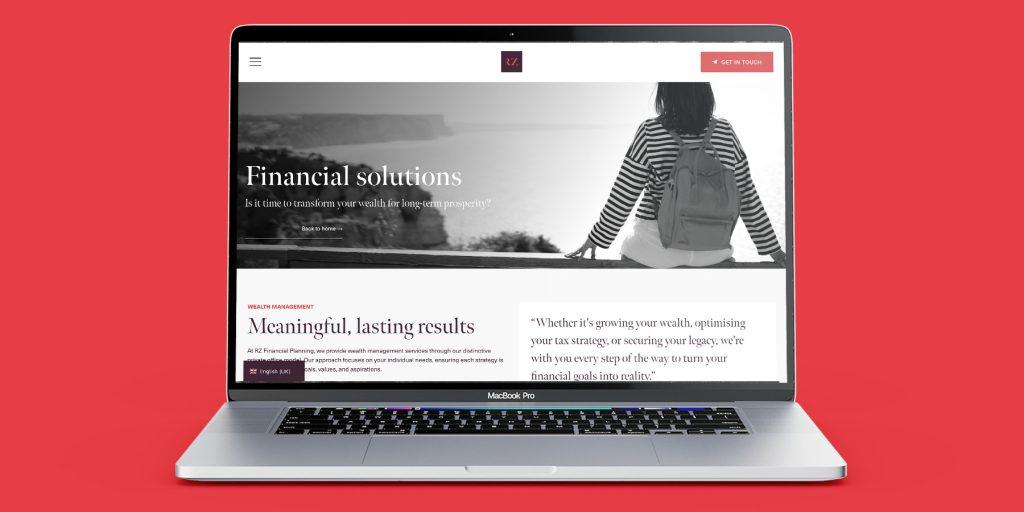
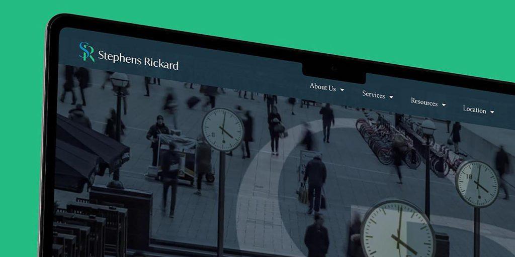
Every website should respond to the particular business behind it. You can see examples of Goldmine’s wider branding, content and digital work through our projects with RZ Financial Planning, Kingsbury & Partners, SPF Private Clients and Fairstone Wealth Leaders.
The finished work differs because each firm has its own audience, proposition and commercial priorities. The common principle is creating a clearer and more consistent experience around the value already inside the business.
Your website should reflect the quality of the advice and relationships behind it.
Goldmine Media
Ready to collaborate?
If your firm needs a clearer website strategy, stronger positioning or a digital experience that connects your advisers, content and brand, we’d love to hear what you’re working on.